Problem
Their Previous branding, suitable for its smaller scale, became misaligned with their evolving vision and risked portraying a lack of cohesion and consistency as they transitioned to a new building.
Client
Riverside Community Church
Solution
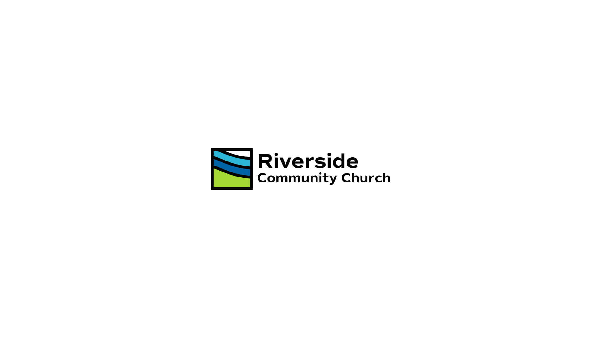
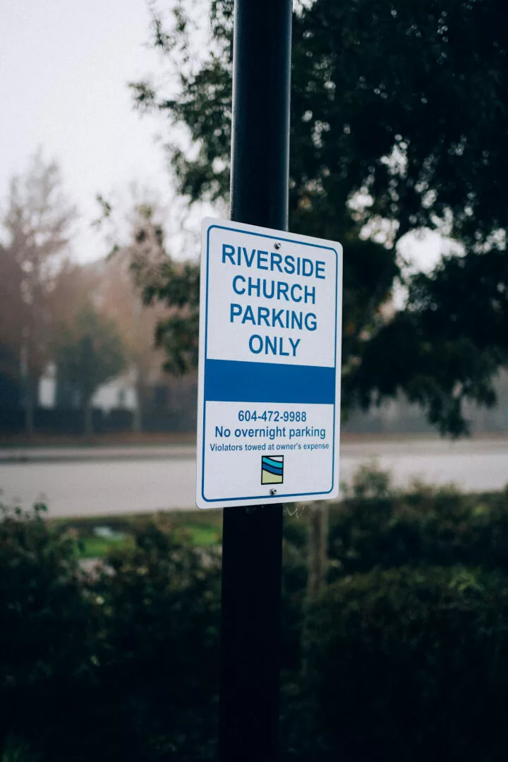
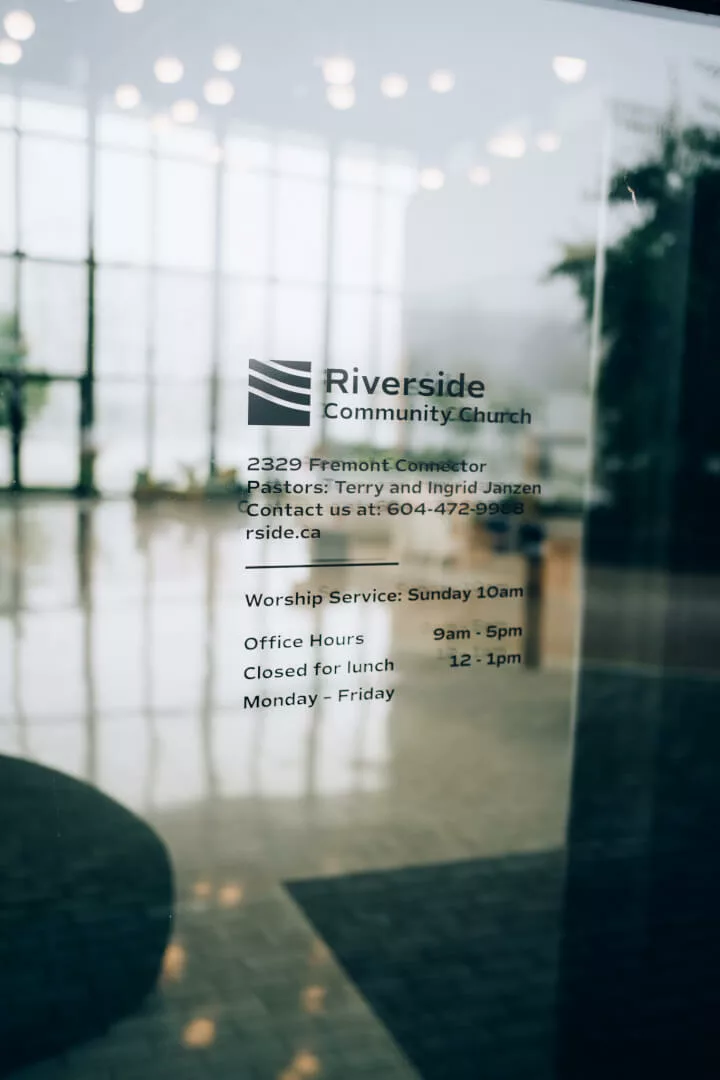
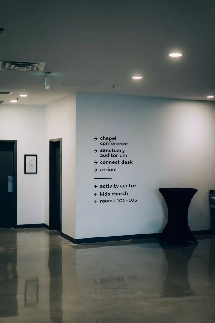
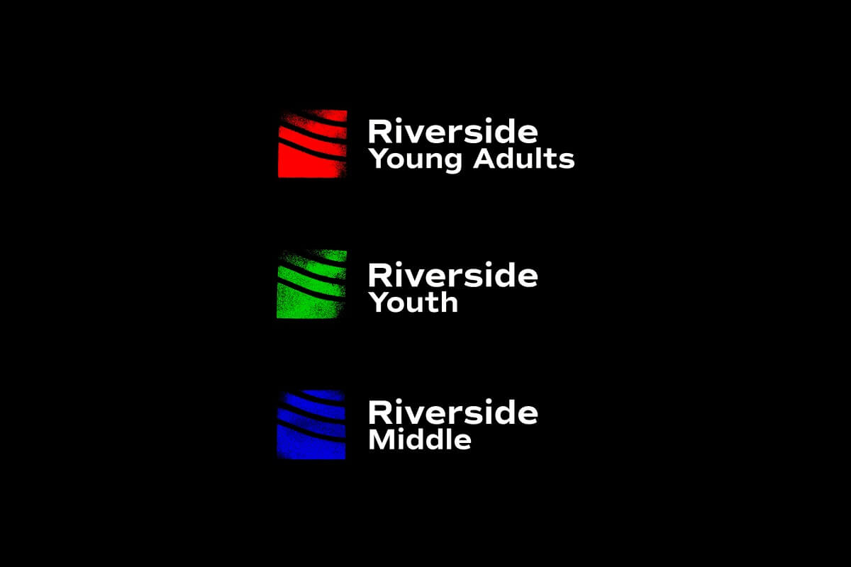
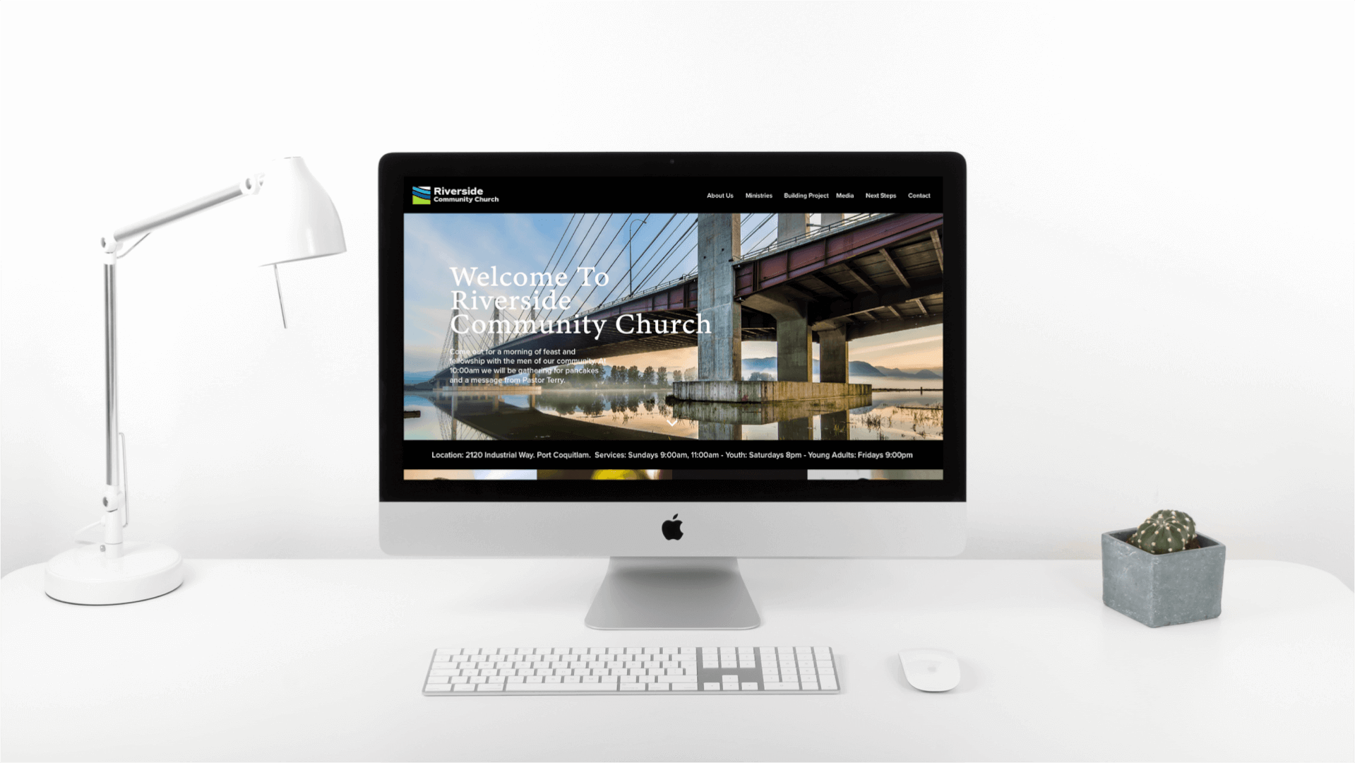
To address Riverside Community Church's need for a rebrand that encapsulated its modern, Christ-centered ethos while emphasizing community, we embarked on a journey to visually define what "Riverside-y" truly means. Our goal was to craft a visual system that evokes the profound feelings parishioners experience every time they step into the church. Drawing inspiration from the church's narrative of hope and its role as a beacon in the community, we were struck by the significance of not obstructing the light shining through the building's glass front. This not only symbolized transparency but also the welcoming and inviting nature of the church. Our final logo concept, a square with a green sliver at the bottom representing the land, geometrically patterned waves in blue, and white for the sky, seamlessly marries the church's past identity with its forward-looking vision. This design ensures that every time someone sees this emblem, whether on a t-shirt in a social media post or on a sign during their daily commute, they're reminded of Riverside's consistent presence and inviting spirit in their lives.
Services Provided
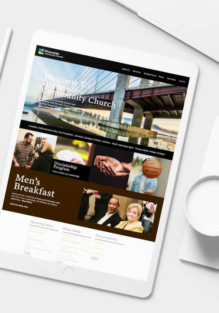
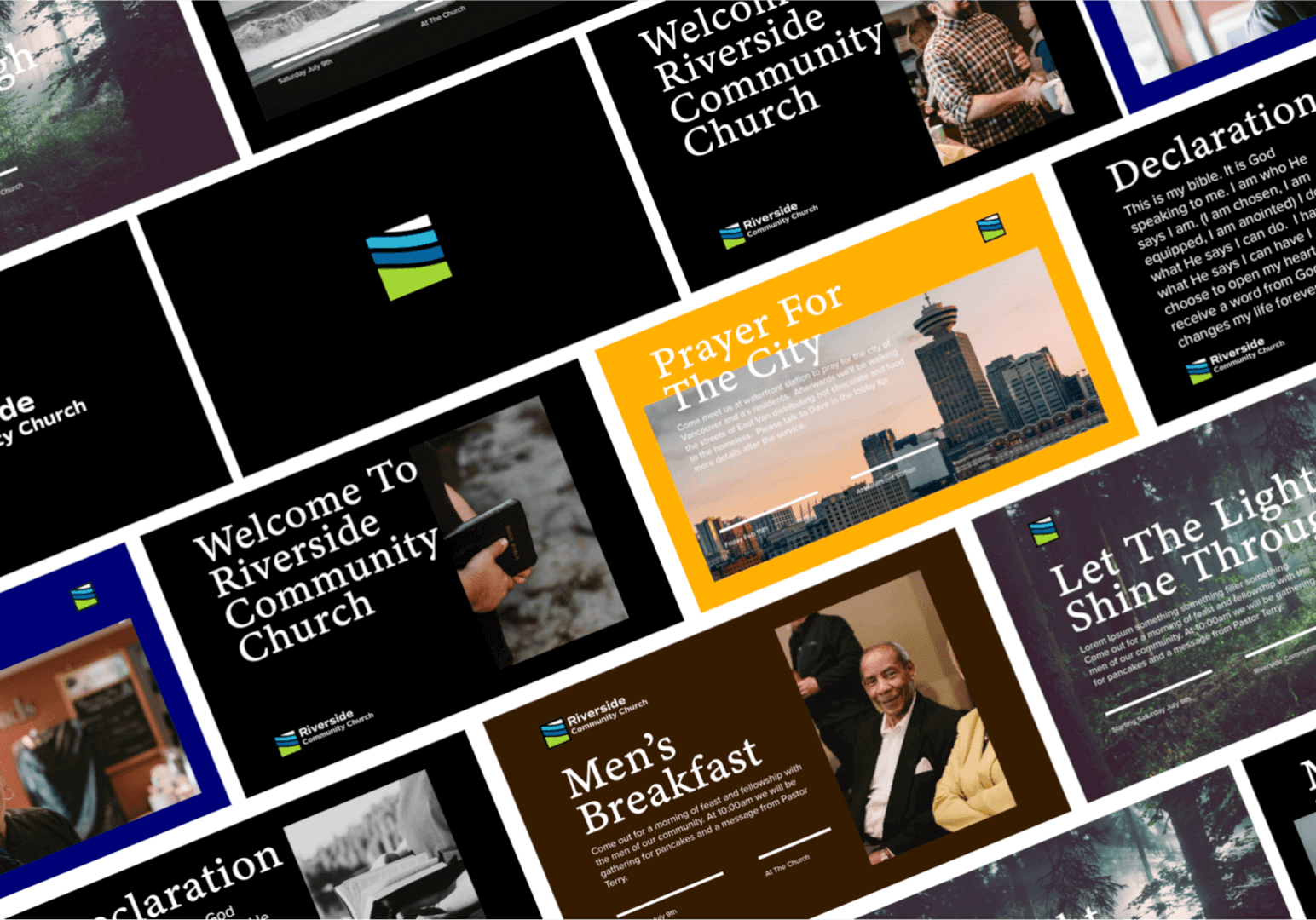
Branding, Copywriting, Web Design, Graphic Design, Photography
Year
2021
Industry
Religion/Non-Profit

Partner with us from anywhere in the world
Together let's tackle your business challenges
Get in touch with us to schedule a free consultation. Together we can help you formulate a plan to increase your online presence, even if you or we decide we aren't the right fit, we can make recommendations about who might be.
Other Work

