Problem
How do you make a brand feel as bold and fresh as the concrete they pour?
Client
Online Curbing and Concrete
Solution
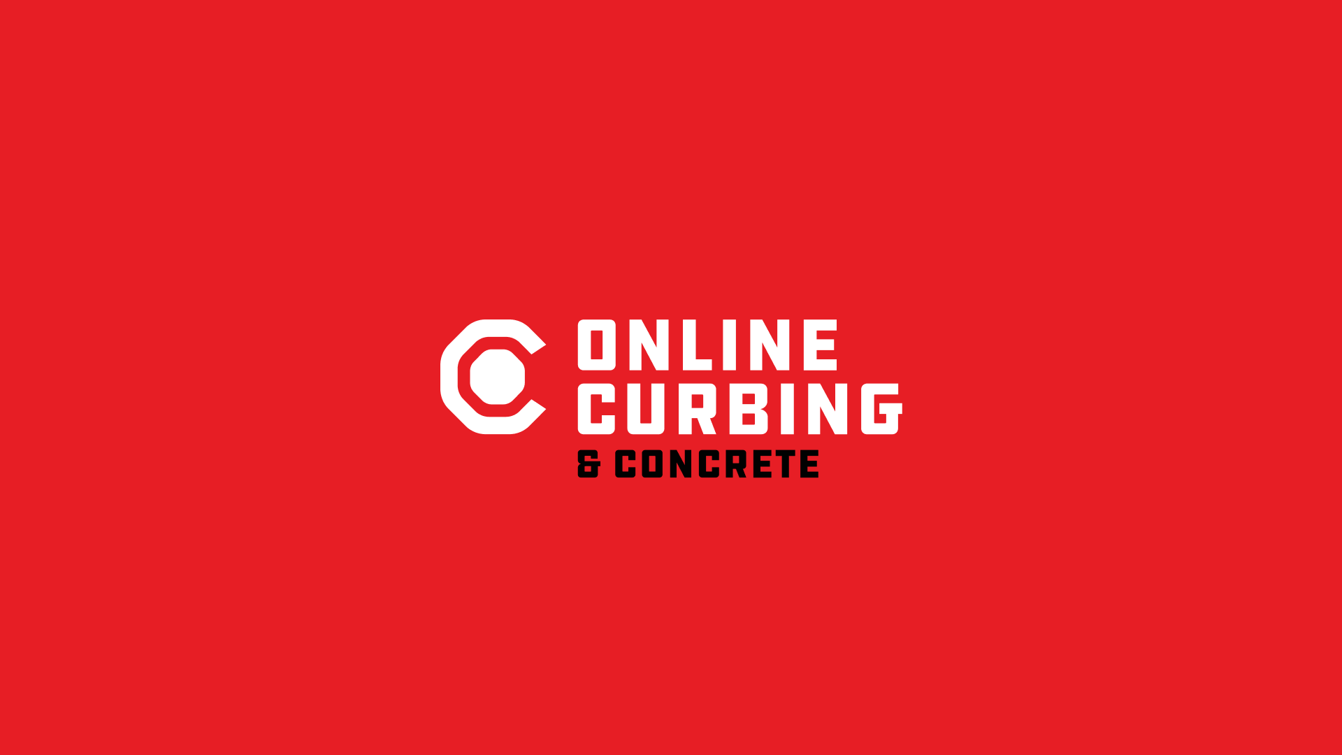
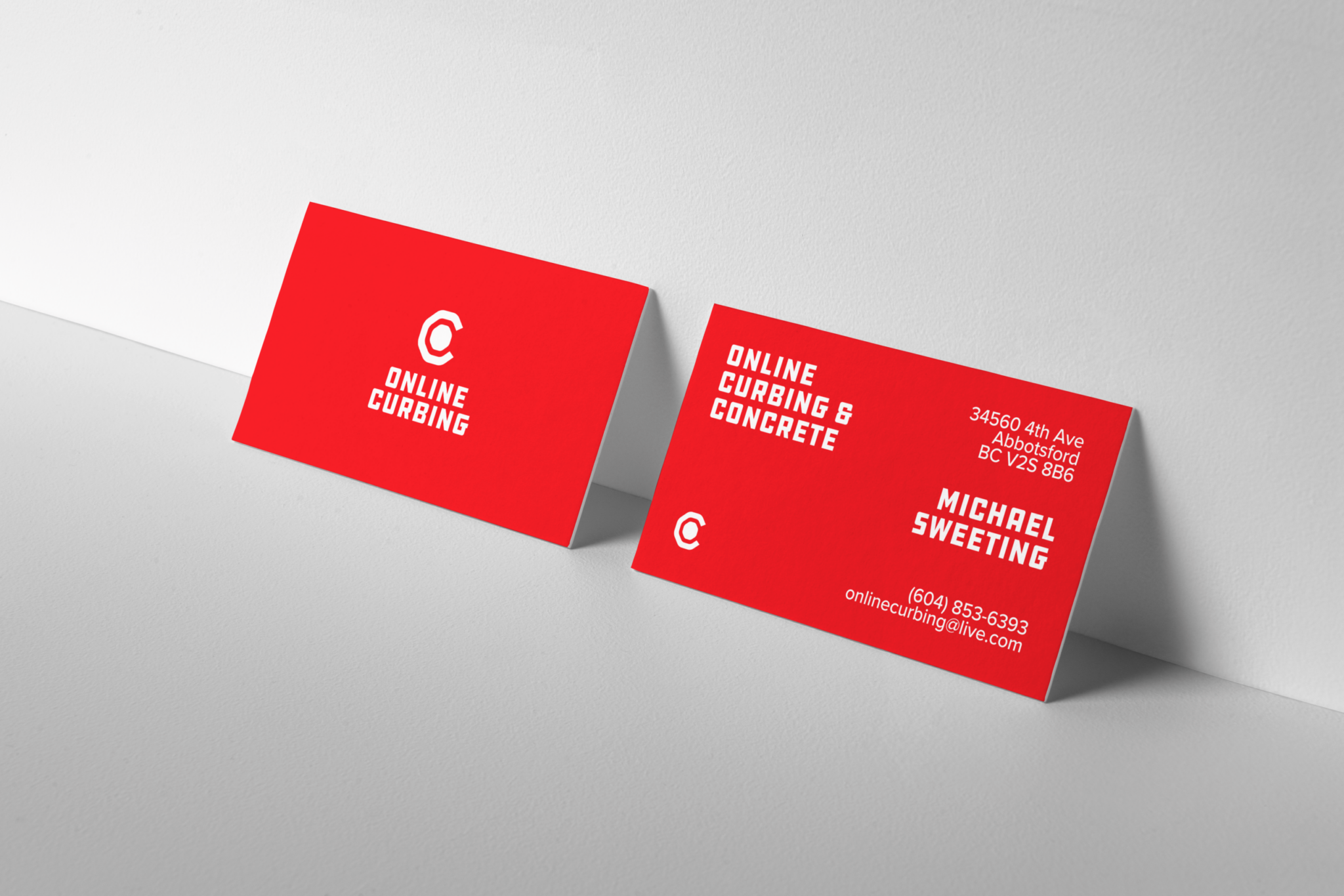
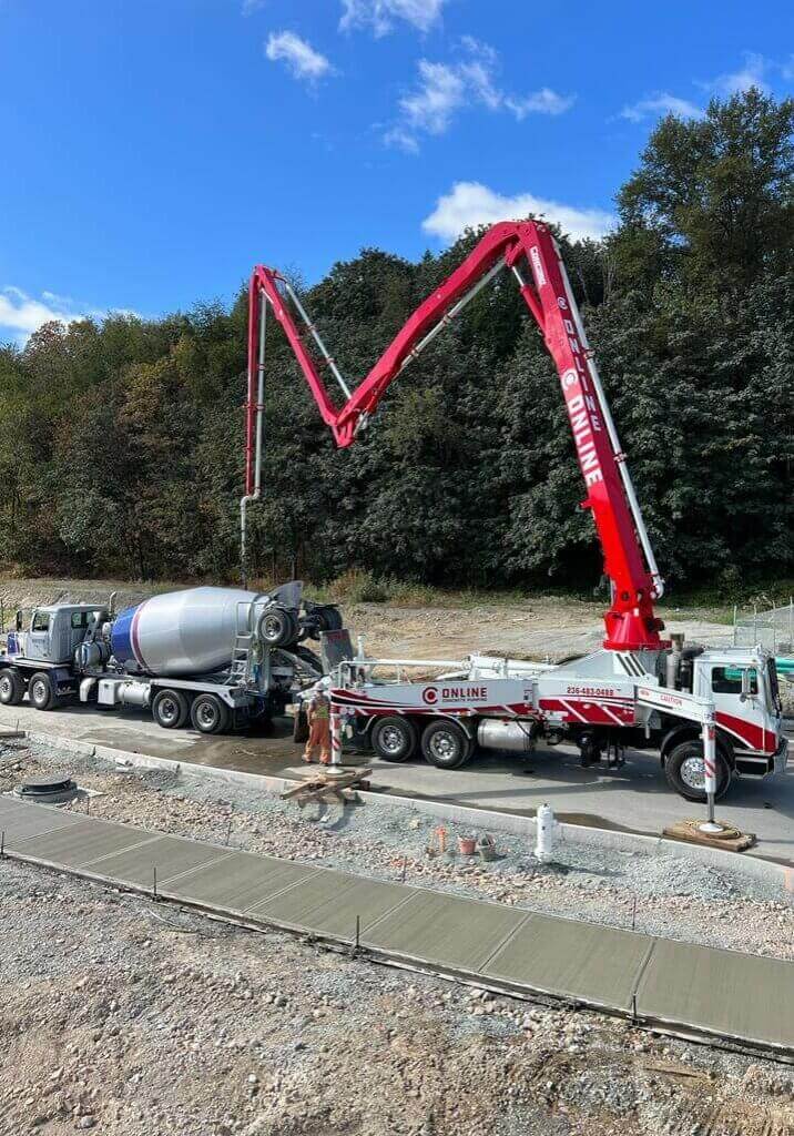
The team at Online Curbing was looking to refresh their brand in order to create new a new look that they could rally behind and increase morale. Together we developed a new modernist symbol and system that loosely resembles a cul-de-sac and the curbs that surround them while forming a capital letter C and O.
Services Provided
Rebrand, Copywriting, Web Design,
Development, Photography
Year
2022
Industry
Construction



Partner with us from anywhere in the world
Together let's tackle your business challenges
Get in touch with us to schedule a free consultation. Together we can help you formulate a plan to increase your online presence, even if you or we decide we aren't the right fit, we can make recommendations about who might be.
Other Work

